In my previous trading lessons, I stated that the better you are at technical analysis, the more likely you are to achieve success in swing trading.
We then explored two of the most important technical analysis concepts -- the trendline and support/resistance. [If you missed our earlier tutorial, click here to read Swing Trading Support & Resistance Secrets]
I then showed you how price patterns such as ascending and descending triangles are created by combining the trendline with support and resistance levels. If you can recognize these patterns, then you'll have no trouble creating low-risk, high-opportunity swing trading strategies with tremendous profit potential.
Throughout this trading course I have laid the foundation for a technical analysis system that works on the principle of multiple indicators -- a swing trading strategy that is based on executing trades when many different chart 'messages' agree with one another. When these excellent opportunities arise, they often result in spectacularly profitable swing trades.
Today I'm going to teach you everything you need to know about one of the key tools I use in this system of multiple indicators -- candlesticks.
I call candlesticks an 'anticipatory' indicator. If you haven't come across this term before, don't worry, it is my own wording. An anticipatory indicator gives a signal in advance of other market action. In other words, it is a leading indicator of market activity.
Momentum indicators such as RSI or stochastics are also anticipatory, since momentum usually precedes price. When both candlesticks and a momentum indicator such as stochastics communicate the same message, it is likely that they are accurately predicting what will happen with a stock.
On the other hand, the break of a trendline or a moving average crossover is what I call a 'confirming' signal. It occurs well after a stock has peaked or bottomed.
Depending on your trading style, you can often act on the anticipatory signal. However, if you prefer to be cautious and wait for more evidence, since candlesticks anticipate a change in trend, they should at the very least put you on the alert that a reversal may be imminent.
How to Read Bar Charts and Candlestick Charts
If you are already familiar with the basics of candlesticks, then you can skip this section. However, if you have seen candles on the web, but have not studied them in some detail, then I'll now give you the background you need to use candles.
Candles may be created for charts of any time period -- monthly, weekly, hourly, or even one minute. When I discuss candles in today's lesson, I refer to a 'day,' but be aware that you can create candle charts for virtually any period.
Below you'll find a three-month bar chart and a three-month candlestick chart for the real but renamed LavaFlow Co. (LAF). See if you can spot any differences in the 'data series.'
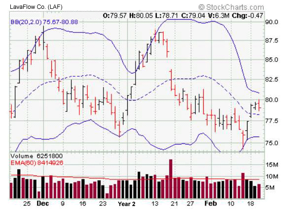
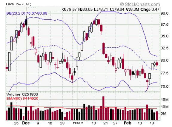
Hard to spot the difference? That's because there isn't any. Both the bar chart and the candlestick chart contain exactly the same information, only it's presented in a different form.
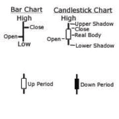
Both the bar chart and the candle chart contain the same data: the high for the period (the day), the low, the open and the close.
In a candlestick chart, however, the names are changed. The difference between the open and the close is called the real body. The amount the stock went higher beyond the real body is called the upper shadow. The amount it went lower is called the lower shadow. If the candle is clear, or white, it means the stock finished the day in positive territory. If the candle is colored, then the stock went down. This information is clearly shown below:
An Innovative Way to Think of Candles
Here is an idea about candlesticks that has always helped me over the years. As with much of the other analysis I bring you in both this trading course and in my other swing trading tutorials, I haven't seen this in books or on the web.
It is generally acknowledged that amateurs dominate the opening of the trading day. Professional traders, on the other hand, dominate the closing. The low of the day, one might say, is set by the pessimists -- they believed the market was going lower and sold at the bottom. The high of the day is set by the optimists. They were willing to pay top price, but were incorrect in their analysis (at least in the short term).
Individual candlesticks may be understood by combining this concept with the candle chart. I will use only two examples, but you might want to experiment with this idea yourself.
Shaven Bottom/Shaven Head -- The shaven bottom/shaven head candle depicts a day in which the market opened at the low and closed at the high. It is a day in which the amateurs were the pessimists. They sold early and eager buyers gobbled up their shares. By the end of the day the optimists and professionals closed the stock sharply higher. This bullish candle often predicts a higher open the next day.

Shaven Head/Shaven Bottom -- This candle is the opposite of the one just described. Depicted here is a day when the amateurs were the optimists. They bought at the beginning of the day, only to watch prices steadily decline. By the end of trading, prices had declined sharply and the professional pessimists were in control of the market. This particular stock will often open lower the following day after exhibiting such behavior.

In my trading seminars over the years, I've found that traders can usually make more sense of candles by reasoning them out in this way. In particular, when you see a candle with a large real body, you should always ask yourself who won the battle of the day -- the optimists or the pessimists, the amateurs or the professionals? This question will often provide you with an important clue to subsequent trading action.
The Advantages of Candlesticks
Candlestick charts have three major advantages over bar charts...
1. Candlestick charts are much more 'visually immediate' than bar charts. Once you get accustomed to the candle chart, it is much easier to see what has happened for a specific period -- be it a day, a week, an hour or one minute.
With a bar chart you need to mentally fill in the price action. You need to say to yourself, 'The left tick says that's where it opened, the right tick where it closed. Now I see. It was an up day.' With a candlestick chart, this is all done for you. You can spend your energy on analysis -- not on figuring out what happened with the price.
2. With candles you can spot trends more quickly by looking for whether the candles are clear or colored. Within a trend, you can easily tell what a stock did in a specific period.
The candle makes it easier to spot 'large range' days. A large candlestick suggests something 'dramatic' happened on that trading day. A small range day suggests there may be relative consensus on the share price. When I spot a large range day, I always check the volume for that day as well. Was volume unusual? Was it, say, 50% higher than normal? If so, then it is very likely that the large range day may set the tone for subsequent trading action.
3. Most important, candles are vital for spotting reversals. Reversals are usually short term --precisely the kind the swing trader is looking for.
When traditional technical analysis talks about reversals, usually it is referring to formations that occur over long periods of time. Typical reversal patterns are the 'double top' and the 'head and shoulders.' By definition, these involve smart money distributing their shares to naive traders, normally over a period of weeks or even months.
Candlesticks, however, are able to accurately pick up on the changes in trend that occur at the end of each market swing. If you pay meticulous attention to them, then they often warn you of impending changes.
Why Candlesticks Work
A chart may be thought of as a picture of the war between supply and demand. When a stock is moving up, the buyers are in control. There is more demand than supply. Purchasers are eager to acquire the stock and will pay up for the right to do so by hitting the ask price. When a stock is declining, the reverse is true. Sellers are fearful and will not dicker over a few cents. Therefore, they are more likely to accept the bid. Candlesticks graphically show this balance between supply and demand. At key reversal junctures, this supply/demand equation shifts and is captured in the candle chart.
The Rule of Two
Generally, no one candlestick should be judged in isolation. The general principle is even if you see a key reversal candlestick, you should wait at least part of one more day before acting. If, for example, you spot a candle called a doji, then you should usually seek verification from the next day's trading action. If the markets gap lower and prices begin to decline, then it is probably prudent to take your position.
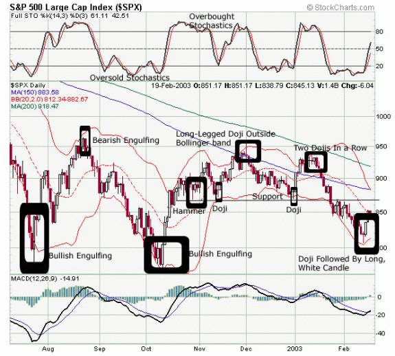
In candlestick theory, a variety of different candles can signal important reversals. In today's lesson we will focus on five candlesticks that called every major turn in the S&P 500 over a six-month period! After first explaining these different candlesticks, I will apply this theory to a thorough analysis of the S&P 500 chart below.
Some Major Reversal Candlesticks
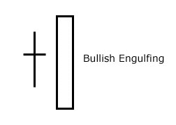
Bullish Engulfing -- The bullish engulfing candle is most significant when it occurs after a prolonged downtrend. The stock or index has been selling off sharply, and on the day of the bullish engulfing, prices will often start the day by falling. However, strong buying interest eventually comes in and turns the market around.
The bullish engulfing gets its unusual name by virtue of the fact that this candle surrounds, or engulfs, the previous one. When I discussed this candle with my university students, I called it 'Pac-Man.' Like the classic video game character, it often 'eats' the candle before it. The bullish engulfing candle represents a reversal of supply and demand. Whereas supply has previously far outstripped demand, now the buyers are far more eager than the sellers. Perhaps this is initially just short-covering at a market bottom, but regardless of the cause, it is usually the catalyst that creates a buying stampede.
When analyzing the bullish engulfing candle, always check its size. The larger the candle, the more significant the possible reversal. A bullish engulfing candle that consumes several of the previous candles generally signals a powerful shift in the market.
Bearish Engulfing -- This candle is the opposite of the one we just discussed. It is most important after an extended uptrend, particularly if the market is overbought and vulnerable to traders who are looking to take profits. The same rules apply to the bearish engulfing. The larger the size, the more important the shift in supply and demand that is signaled.

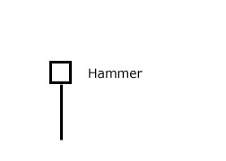
The Hammer -- This hammer marks a reversal off a bottom or off an important support level. On the day of the hammer, prices decline. They hit bottom and then rebound sharply, making up all the ground -- and sometimes more -- that they lost when the selloff started. The candle shows that buyers have now seized control. A bullish candlestick on the following day confirms this analysis.
A close relative of the hammer is called “hang-man.” It looks exactly like the hammer, but it occurs after an extended rally and is very bearish.
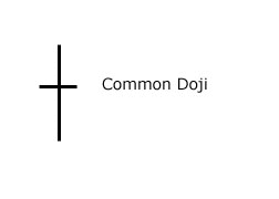
The Doji -- It you were to learn only one candle, then this would have to be the one. A 'common' doji, as I call it, is shaped like a cross. A doji has no real body. What it says is that there is a stalemate between supply and demand. It is a time when the optimist and pessimist, amateurs and professional are all in agreement. This market equilibrium argues against a strong uptrend or downtrend continuing, so a doji often marks a reversal day.
A doji in an overbought or oversold market is therefore often very significant. In these cases, you'll want to carefully watch the opening on the following day to see if the market carries through on the reversal. Note: A candle with a very small, real body often can be interpreted as a doji.
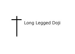
The Long-Legged Doji -- The long-legged doji occurs less frequently than the common one, but gives an even clearer signal. At the top of an extended move, it says the bulls tried to move the market higher but couldn’t do it. The market didn’t like living at that 'altitude.' A long upper shadow is generally the result, along with, I suspect, a lot of nervous optimists.
When the market is oversold, this candle's message is very different. The day might begin very weakly. Buyers, however, then come into the market and establish a supply/demand equilibrium by the close. Now the shorts are nervous and may be tempted to cover, sending the market sharply higher in the next session.
Back to the S&P 500 Chart
Earlier in this lesson, I mentioned the five candlesticks that called every major turn in the S&P 500 over a six-month period! Since I have now explained the major reversal candlesticks on the previous page, I will show how to apply the theory behind these candlesticks in a thorough analysis of the S&P 500 chart. I have labeled 10 major points on the chart below:
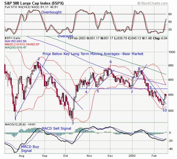
1. The mid-July low was marked by a thrust outside the Bollinger Band ®. Stochastics were also oversold. The reversal day was a bullish engulfing candle. The real body covered a wide range of price values, from 800 to over 840. Stochastics quickly confirmed the candle's signal. The MACD signal a few days later was late, but ultimately would have proven profitable.
2. The rally lasted a month and carried the S&P to the opposite end of the Bollinger Band. Stochastics were overbought. The rally concluded with a bearish engulfing candle. A minor support level formed around 930, but once this broke, the S&P came down hard.
3. From late August to early October the S&P went almost straight down without interruption. Stochastics were very oversold and the index went outside the Bollinger Band. Finally, in early October, the S&P reversed. The candlestick? A bullish engulfing. Hmmm... The same candle marked two major lows in a row. How interesting!
4. The October rally was swift, as the S&P soared almost 100 S&P points in just four trading days. The index then drifted higher to the 900 level and retraced. The first time it touched 868 -- a support level that was to become extremely significant - - it did so with a hammer candlestick.
5. The October to late January period marked a four-month trading range. Within this trading range I have drawn trendlines to show when the rally phase ended. note how at point five, the S&P tested the aforementioned support level. The candlestick on that particular day was a long-legged doji.
6. The rally that began in mid-November ended in early December. Which candle marked an end? A long-legged doji. Note the very large upper shadow that pierced through the Bollinger Band.
7. From the beginning to the end of December, the S&P sold off persistently. The selloff concluded with a doji. It was then followed immediately by a shaven bottom/shaven top candle.
8. The rally that began in early January petered out by mid-month. S&P 935 became a strong resistance level. Notice how the top was marked by two dojis in a row. A very small rally attempt on the third day was followed by a bearish engulfing, which consumed the three previous trading days. From here it was 'curtains.'
9. Note how the break of support occurred on a large-range, bearish engulfing day.
10. After a sell-off of approximately 130 points, the S&P finally reached bottom in mid-February. The candlestick? A long-legged doji. And once again, it was followed by a powerful long white candle.
Conclusion
It's amazing how often the same candlestick patterns repeat themselves. In the war for swing trading profits, think of candles as your personal sentry. When analyzed properly, they should provide you with consistent early warnings of impending trend change. It is also why I have used today's lesson to share some of my thoughts with you on this very valuable tool. Although you probably now know more about candles than most traders, you need to be aware that there is much more to learn. All in all, there are about 60 candles patterns the swing trader should recognize.
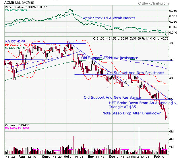
In my previous trading lesson -- 'A Swing Trader's Support and Resistance Secrets' -- I concluded by presenting you with a short exercise. If you were interested in applying what you had learned, I offered up a chart of the renamed Acme Ltd. (ACME) and challenged you to:
1. Draw important trendlines
2. Label important support and resistance zones
3. Decide if the stock was in an ascending or descending triangle.
In the chart below you'll find my 'answer' to this short exercise...
Trendlines, support and resistance and candles form three key components of a successful swing trading system. Yet in our next trading lesson, which I've entitled 'The 11 Commandments of Swing Trading,' I'm going to shift my focus to successful trading strategies and tactics. In it, I will share with you a good part of what I have learned through more than 40 years of active trading and investing. Stay tuned!


