What is a Candlestick?
Candlestick charts are often used in technical analysis to track price movements of securities, derivatives and currency over time.
How Does a Candlestick Work?

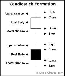
The upper and lower shadows are the two thin vertical lines that look like candle wicks. The upper shadow represents the highest price for the time period, and the lower shadow represents the lowest price.
The real body is the rectangle sitting between the two shadows. It represents the opening and closing price over the given time. If you think of the upper and lower shadows as wicks, the real body would represent the candle.
A white (sometimes blue or green) real body indicates that the market rose; in this situation, the lower line represents the opening price, and the upper line represents the closing price. When the real body is black (sometimes red), the market fell; in this case, the lower line represents the opening price and the upper line represents the closing price.
If you have a hard time remembering which color corresponds with which open and close, a little common sense can help reason it out: If the market is rising (white real body), then the closing price will be higher than the opening price. If the market is falling (black real body), then the closing price will be lower than the opening price.
Why Does a Candlestick Matter?
This style of charting is very popular due to the level of ease in reading and understanding the graphs. The patterns formed by candlesticks are given memorable names such as dragonflys, dojis, hammers, and morning or evening stars. These charts are widely used to identify potential turning points in a market.


