What is a Histogram?
A histogram is a visual display of information. It uses bars to show the frequency of an item of data in successive intervals.
How Does a Histogram Work?
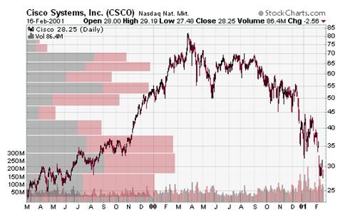
A price by volume chart (PBV chart) is a common horizontal histogram that shows a cumulative total of how many shares of a stock traded at a given price. The bars show the trading volume. In our sample histogram for Cisco Systems (Nasdaq: CSCO) (and in many charts of this nature), there is also a line indicating the stock price.
The longer the horizontal volume bar on the histogram, the more shares that are trading at a given price.

Why Does a Histogram Matter?
In the finance world, histograms are very useful because they indicate where the action is. In our example, note that the longest bar relates to the $27.50-$32.50 price range, meaning that the most trading volume in this stock occurs when the shares are trading between $27.50 and $32.50. Obviously, lots of trading volume also occurs in the $32.50-$37.50 range, but relatively few buyers and sellers want to trade when the stock is in the $42.50-$47.50 range or anywhere north of $70.
Accordingly, a histogram in this context could help analysts try to predict when the stock will encounter support and resistance -- that is, when a stock will reach its top and bottom price. This in turn helps analysts decide when to buy and when to sell. It is important to note, however, that histograms are just one of many charts that analysts use.


