In our last trading lesson I acquainted you with trends and trendlines (if you missed it, click here to go back and read How Swing Traders Harness the Power of Trendlines). I started by showing how the simple labeling of peaks and valleys could help you determine if a stock was in an uptrend or a downtrend. Recognizing the trend of the stock is the key to profitable swing trading.
I also introduced you to a few simple rules to follow when drawing trendlines. These are rules I use every time I draw a trendline on a chart and they are vital for keeping me on both the right side of the market and on the right side of any given trade. Along with this, I taught you the importance of not fighting the trend. One of the most profitable swing trading strategies I know of involves buying on the break of the downtrend line and taking profits on the break of the uptrend line.
Finally, for those interested in more practice, I challenged you to analyze a chart of the fictitious Trendco Inc. (TREN) to gain practice with drawing trendlines. I'll go over my interpretation of those trendlines at the end of today's trading lesson.
In the meantime, the TREN chart will also serve as our focus for today's discussion of support and resistance. Although the TREN chart covers almost the same period as the one I used for trendlines, I've made some minor adjustments like adding moving averages, reducing the number of indicators and enlarging the chart size.
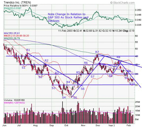
As you can see, instead of labeling the chart with 'P' for peak and 'V' for valley, I have now marked the key highs and lows with 'S' for support and 'R' for resistance from R1 to R9 and S1 to S10.
The discussion of support and resistance in today's trading lesson contains an extremely detailed analysis of TREN's chart. I highly recommend you print this lesson to gain the maximum benefit from it. To fully appreciate how you can profit from careful identification of support and resistance levels, you will want to frequently reference the TREN chart throughout the lesson.
Finding Support & Resistance
Let's look at the TREN chart right off the bat.
First, note that when this particular time period began, the stock was in a long-term downtrend. (That's relatively easy to see on the chart by examining the relation of the stock's price to the long-term 150-day or 200-day moving average averages.)
The first point I want to examine is in July, and it's labeled 'S1.' Note how the overall downtrend was arrested for several days, right around $40, as the buyers temporarily overwhelmed the sellers. In fact, buying demand was strong enough to push the stock back above $45, where it subsequently faltered. I have labeled the point of faltering, where supply overcame demand, as 'R1,' a level of resistance.
Note that S1 and R1 occur very close to the 'round' numbers of $40 and $45. This is a point we will return to later, and it is a very important concept in swing trading.
.gif)
Now, let's follow the stock as it declines:
- R1-S2. TREN trends sharply downward. It finds support in early August at $35, where it then moves sideways, or 'consolidates,' for several days.
- S2-R2. The shares rally briefly from roughly $35 to $40. Notice how we can connect R2 with S1 by using a straight line. What had been for a short time a support level has now turned into a resistance level.
- R2-S3. Between mid-August and early September the shares drop precipitously, from $40 to $30.
- S3-R3. The rally is brief. TREN recovers to $35. What had been support at S2, $35, has now turned into resistance at R3.
- R3-S4. A mid-September decline takes TREN from $35 to $27.
- S4-R4. TREN pushes back to $30, the level at which it had previously found support (at S3).
- R4-S5. The shares decline to their final early October low of just over $25.
In a little while I'll analyze the uptrend starting at S5. But before I get into that, I want to summarize what we can learn about support and resistance by analyzing this downtrend.
A number of the concepts I'm going to talk about next are seldom discussed explicitly in technical analysis literature, yet they are extremely important to master if you want to swing trade with maximum profitability. So we'll take a closer look at thrust, consolidation, and countertrend movements.
Identifying Thrust, Consolidation & Countertrend Movements
The July to October period captures TREN in a strong downtrend. From approximately $45, TREN declined to just over $25 in about four months. We can subdivide this overall downtrend into segments that I will call 'cells.' (This is my own term, so don't be alarmed if you have not have seen it before.)
R1-S2-R2 is an example of a cell. The next cell is R2-S3-R3. The final cell in the downtrend is R3-S4-R4. (In the following cell -- R4-S5-R5 -- the trend then reverses.)
Within each cell you can spot three different types of price movement. I have called these 'thrust,' 'consolidation' and 'countertrend Movement.'
Each cell begins with a period of thrust. The order of consolidation or countertrend action that occurs after the thrust often varies.
.gif)
Again, I call the first period of a given cell 'thrust.' It is a time of very strong trending action and can be identified on the TREN chart, for example, between R1 and S2. During that time period the price went from $45 to $35 in just a few trading days.
After TREN reached $35 in early August, shares moved sideways for about 10 trading days. This was a time of 'consolidation,' or a trendless, sideways movement. The cell ended with a 'countertrend' rally when TREN climbed from $35 to $40 in three trading days. I have labeled the peak of the countertrend movement as 'R2' on the chart above. Not accidentally, this countertrend rally halted at almost the exact level as the S1 broken support.
Carefully follow any of the 'cells' in either the uptrend or downtrend and you will find that thrust, consolidation and countertrend movement comprise them all. This concept can help you as a swing trader by providing a roadmap to the price action and a guideline for trading strategy.
For instance, when TREN retraced from S2 to R2 and then stalled, you could have initiated a short position. If you were more cautious and wanted more certainty that the countertrend rally would fail, then you could have waited for TREN to break below S2 at $35. At that point you could then have gone short. Even from $35, you'll note that the shares declined to $30 in just five trading days -- a swing that could have yielded the alert trader a +14% profit in just one week!
You could have again entered a short position at R3. The gravestone doji candlestick occurring at resistance was a strong signal that the countertrend rally of this cell had ended (click here for Dojis 101). Again, if you wanted more safety and more evidence, then you could have waited until TREN broke below S3 at $30. A short here would have still returned about $4 per share, or +13%, in just six trading days (although you would have needed to be alert to avoid the rapid reversal).
Why Support Becomes Resistance When It's Broken
There are generally six sources of simple resistance that the swing trader may use to analyze a chart and find highly profitable trading opportunities. 'Simple' support or resistance occurs when a price level is touched for a few days. (Note that I always distinguish between that and 'significant' support or resistance, which is a price level returned to over and over again.)
- Simple support and resistance often occur at round numbers. For TREN this took place at each $5 interval between $25 and $45. For stocks under $10 each dollar increment seems to present round-number support and resistance, with $5 and $10 being particularly potent prices. When you analyze a stock, always check to see the round number prices at which it is finding support and resistance.
- A support level, once broken, is highly likely to become new resistance. For example, TREN had support at $40 at S1. The next rally back to this level at R2 failed. Five months later, at R6, the rally also stalled at this price point.
- A resistance level, once broken, is likely to become new support. Note how TREN stalled twice at $35 at R3 and R5. When it finally overcame R5, the shares twice found support or buying interest at this level (at S7 and S8).
- You can usually define support and resistance by drawing horizontal lines on the chart. There are, however, several other sources of buying power and selling pressure. For example, an uptrend line often represents a moving support point. Note how an uptrend was confirmed by TREN touching the line three times at S7. Had you purchased within the next several days as TREN came close to -- but did not break -- the uptrend line, then you could have racked up substantial trading gains simply by purchasing at trendline support. Interestingly enough, a broken trendline can also serve as support or resistance. You can see this occur on the TREN chart at S6.
- A moving average can be thought of as a curved trendline. Note how the 20-period moving average (the dashed line) provided resistance during the downtrend by being above falling prices. Similarly, when the trend reversed it provided support to the uptrend by being below rising prices.
- The bottom or top end of a Bollinger band can also serve as a support and resistance level. The swing trader should be careful, however, not to use this idea mechanically, as a stock's price can sometimes 'ride' or 'climb' the band.
A change in visual pattern in early October should have put the vigilant trader on the alert that a significant shift in TREN was taking place and that the stock should no longer be traded short. Note the very important change at this time.
.gif)
R4 should have served as the first level of resistance to TREN. This pattern had held for the previous four months, yet it didn't hold during the mid-October rally between S5 and R5. Instead, the stock blew through $30, breaking the downtrend line. After a very brief countertrend retracement at $35, TREN then soared to resistance at $40 at R6.
At that point, the observant swing trader should have been fully aware that for a period of time the downtrend had reversed and that TREN had begun an uptrend, which is defined as a series of higher peaks and higher valleys, or higher levels of resistance and support. Note that the pullback at S7 was at a higher level than at S6. TREN then had a final recovery peak at $45 at R7 in late November.
Shortly after R7, the uptrend line broke. Again, the pattern of lower highs and lower lows, and of lower levels of resistance and support, resumed. Except by those swing traders with an extremely short time frame, say one or two days, the stock should not have been traded from the long side after that point.
The Alternation Principle
What I call the 'Alternation Principle' is one of the most important and profitable of all technical analysis guidelines. It states that when a significant support level is broken, that level, if and when retested, should serve as new resistance.
Similarly, if a resistance level is broken, then that level, if and when retested, should serve as new support. In my experience, the alternation principle works approximately 85% of the time. Even when it doesn't, it at the very least gives the swing trader significant information about the strength or weakness of the stock.
Here's a riddle. What is the most important price on the price chart?
Answer: The price you paid.
This simple idea has important psychological implications. Let's say you bought TREN at $40 in early July (S1). Immediately, the shares rise to $45. Not only is the transaction profitable, but it also confirms your feelings of self-esteem: you have made a good trading decision.
.gif)
However, let's say you choose not to take your profit. By mid-August (S2) you not only have forfeited all your profit, but TREN is actually down to $35 and you are now stuck with an unrealized capital loss. Now the shares rally back to just above $40 at R2. Will you choose to sell?
You now have a chance to get out at breakeven, or perhaps with a profit of 25 or 50 cents a share. Psychologically speaking, at this point a breakeven trade may feel like a gift from the stock market gods! Multiply this behavior by all the thousands of traders in the stock and you can see why a support level, when broken, becomes new resistance and is apt to turn prices back when retested.
Similarly, let's say you have been watching TREN trade strongly off its October bottom. You think it will hit resistance at $35, but instead it blows right through that level and goes to $40 at R6. You don't want to chase the stock, so you don't buy. Finally, it comes back to $35 at S7 and seems to hold. At that point you might seize your opportunity to buy at a 'bargain' price.
Taking Advantage of Price Patterns
Price patterns go back to the work of Schabaker in the 1920s, with Edwards and Magee building on his ideas in the 1930s. The idea of price patterns is that they repeat themselves over and over again throughout time. If you can recognize the price pattern and accurately predict it, then you're likely to make substantial swing trading profits.
I use price patterns to create profitable swing trades. The vast majority of price patterns are formed by combining a trendline with a support or resistance level. Two of the most important price patterns to recognize are the ascending triangle and the descending triangle.
The ascending triangle is made up of a horizontal level of resistance and an uptrend line.
In a bull market, it is often safe to play the ascending triangle before the breakout since prices are likely to leave a price formation in the same direction they entered.
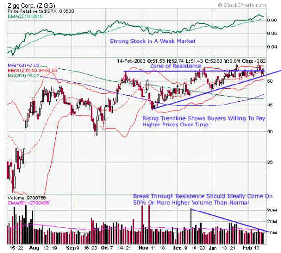
In a weak market, the swing trader should generally wait for a convincing breakout before going long. You'll want to see stronger-than-normal volume on the breakout, as that will indicate buyers are more anxious to acquire the stock than sellers are to part with it. The chart of a real company with the fictitious Zigg Corp. (ZIGG) name below provides us with a great example of an ascending triangle formed during a very weak period for the S&P 500. These types of stocks are often worth following closely because when the market does turn higher, they then become the new leaders.
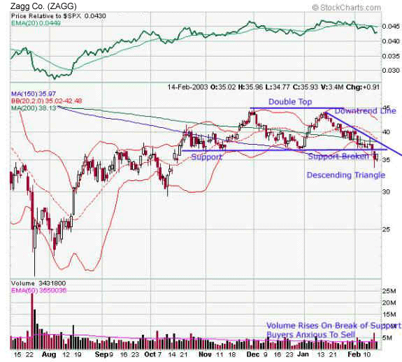
The opposite of the ascending triangle is the descending triangle, which is formed by a downtrend line and a horizontal support line. You can frequently find this price pattern in bear markets. The charts of ZAGG Co. (ZAGG) below clearly illustrate this pattern.
Pulling It All Together
Trendlines and support/resistance levels are perhaps the two most important tools for analyzing a chart. Over the course of the last two trading lessons I have described both of these concepts for you in great detail. They should not only provide you with a strong foundation in technical analysis, but should also help you improve your own ability to find and execute profitable trades.
In addition to these general concepts, you learned several specific principles of using support and resistance to initiate profitable trades. You can, for instance, sell short during a downtrend when a stock penetrates a simple or significant support level. Meanwhile, during an uptrend you can go long when a stock penetrates a simple or significant resistance level. These are often high-probability trades, particularly when you take into account the other technical indicators on the chart.
In our next trading lesson I will cover a tool that I find absolutely vital for swing trading success -- candlesticks.
Candlesticks are important because they often send out an early warning signal when a trend is about to change. Think of them as a sentry alerting you to an impending bullish or bearish counterattack. They can help you protect a profit or initiate a short position.
Some traders use candles as an entire system in and of themselves. However, my style is to combine them with other technical analysis tools like trendlines, support and resistance, and momentum divergence. This use of multiple indicators -- where the decision to go short or buy long is based on many confirming messages on any given chart -- is what provides me with high-probability trades.
But what if I told you that if you recognized five -- yes, that's right, only FIVE candlesticks -- you would have been able to call every major reversal in the S&P 500 in a specific six-month period. Curious? If so, then I'd urge you to join me for the next trading lesson, 'Swing Trading by Candlelight.'
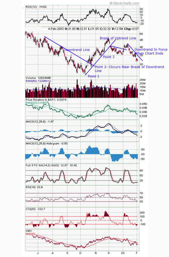
Before I wrap up this tutorial, here's the 'answer' to the question I posed at the end of our last trading lesson. You'll find my interpretation of the trendlines on the TREN chart below. If your lines agree with mine, great! But if they don't, you are not necessarily wrong. A trendline is merely an interpretation of a stock chart, and there are times when different interpretations are defensible. If you are new to trendlines, you will find the more you draw them, the more confident you will become.
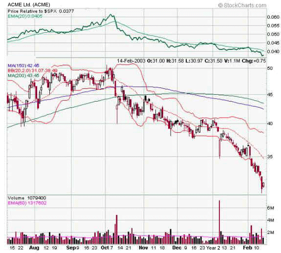
If you enjoyed the challenge I presented you with above, then perhaps you're ready for another! The stock I've chosen is the fictitious Acme Ltd. (ACME). Instead of merely having you draw trendlines, this time I'd like to see you do three things based on the information you've gathered from the last two trading lessons:
1. Draw the trendlines
2. Spot the key support and resistance levels
3. Determine whether the stock broke out or broke down from an ascending or descending triangle.
Again, I will discuss the 'answer' to this challenge in my next special trading lesson, so stay tuned!


